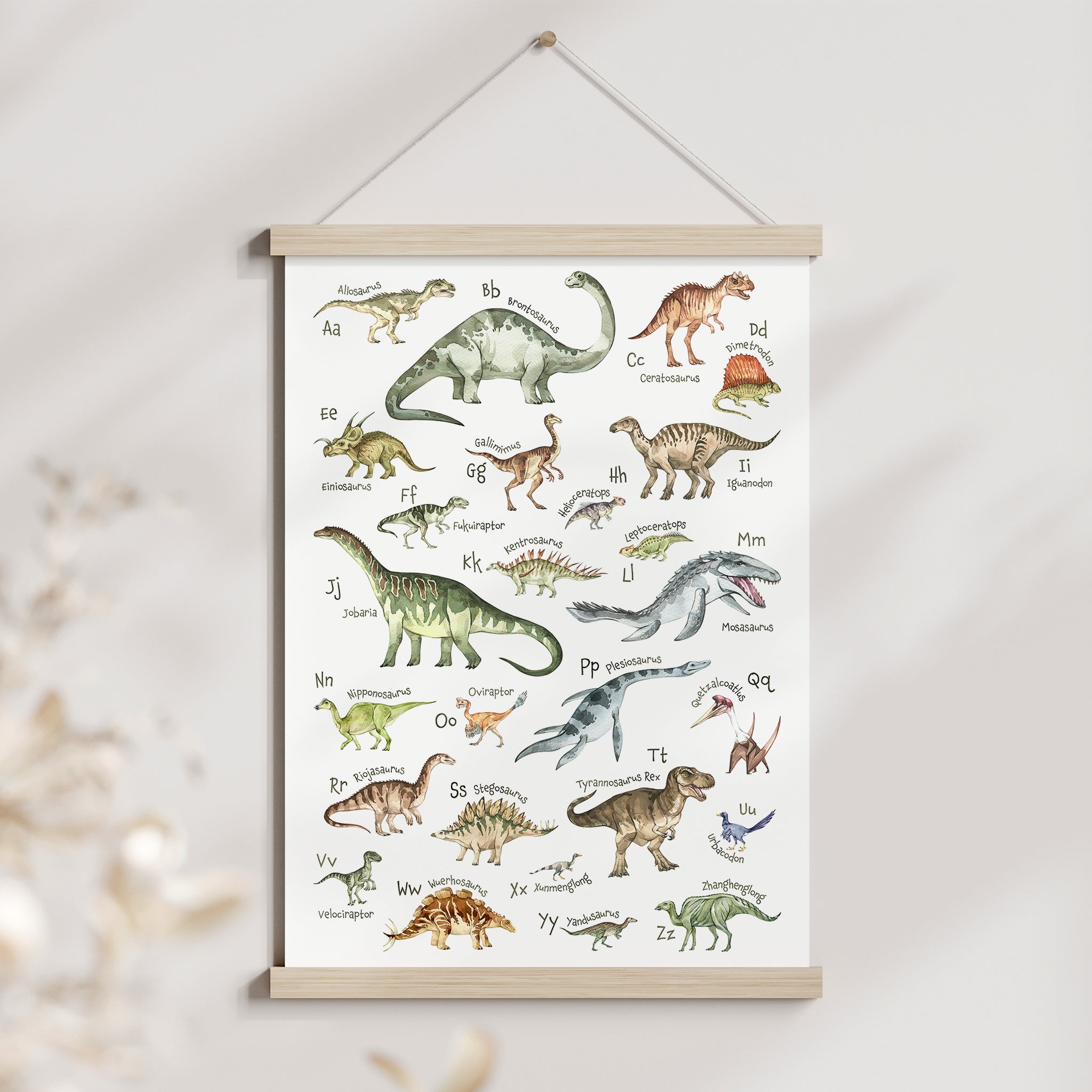
Size Matters! Your Guide to Choosing the Right Size Prints for your Little One's Room
Finding the perfect size (and print design) gives the room a cohesive, finished look. If the size isn’t quite right, something will feel off. Too small and the print gets lost or looks like it doesn’t belong. Too big and the space may feel crowded or overwhelming.
So how does one figure out what size is best?
We get this question a lot and it's a trick question because the answer always depends.
The easiest way to explain this is to look at some examples of what works and what doesn't.
In this post, we'll focus specifically on prints hanging over a crib, bed or dresser. This is an easy way to connect different elements in the room together and is also a very common spot to display prints in the nursery.
A good guideline is to have a print or set of prints fill about 2/3 or 3/4 of the width of the furniture.
For the examples below:
On the left, the print feels too tall and narrow for the wide wall space above the crib.
Instead, go with a horizontal or landscape orientation like the example on the right. This layout balances with the wall area above the crib much better.

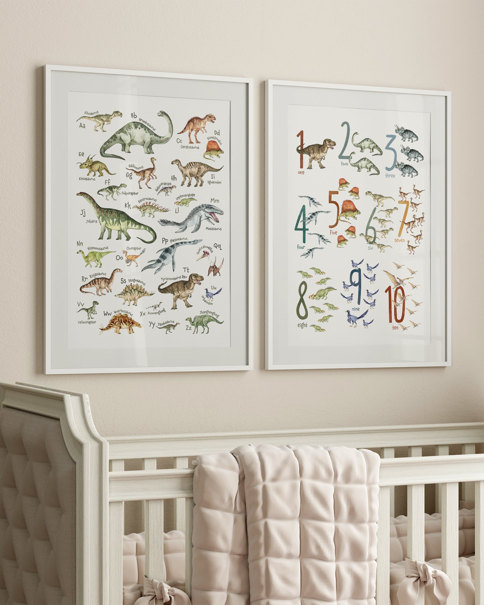
An alternative to having one big wall print is to hang two prints side-by-side like these examples below.
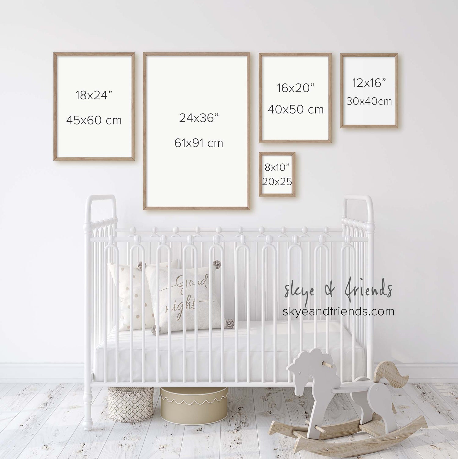
On the left side, two 24x36" prints are paired together. This works well if the room:
- is spacious with tall ceilings
- is bold and maximal in style
- has a longer crib size
In a room that is on the smaller size or has low ceilings, two 24x36" prints could feel a bit crowded.
Instead, go for a set of 18x24" prints, like the example on the right. This size balances the space above the crib much better without feeling overwhelming or like the prints are taking over the space. Could we go smaller? Let's see in this next example.
I love the example on the left with the two 16x20" prints because this size is a good balance of having an impactful layout/design while staying low budget with a smaller print and frame size.
On the right side, with the two 12x16" prints, I give it a maybe. This could work if you like a minimal style or if the crib is smaller. You can also use a bigger frame with a mat help to the prints look bigger visually.

Can we go even smaller?
Both examples below get checkmarks from me because an asymmetrical layout is a really good trick to take up more space. This is especially helpful when working with smaller size prints as in the example on the right with the two 12x16" prints.

Putting it all together.
I hope this post gets you thinking about how print sizes can impact the overall look of your little one's room.
For reference, the crib shown in the pictures above is sized at 53 7/8", relative to the print sizes. I went with the same length as the Ikea Sniglar crib when putting these examples together, which is the crib we used for my daughter.
Other factors like the room size, style and size of the crib also play a part in how different sizes look so remember that these are guidelines, not rules! Use painter’s tape to help you ‘see’ how the print will look up on the wall.
Happy decorating!
Vivian

